Docs
Everything You Need to Know
Layouts
Cards
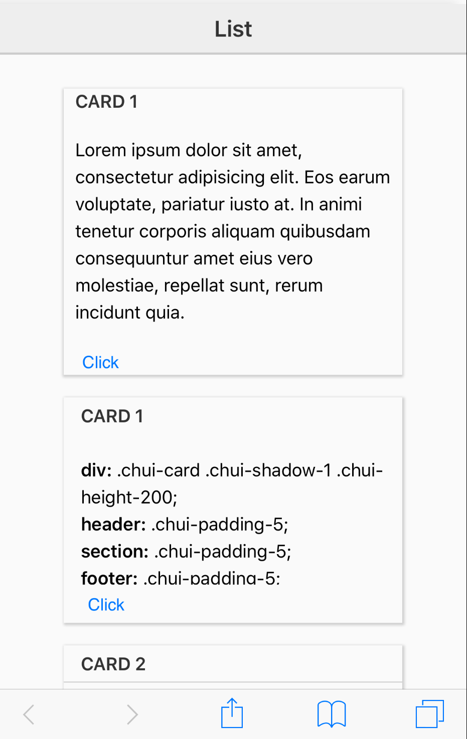
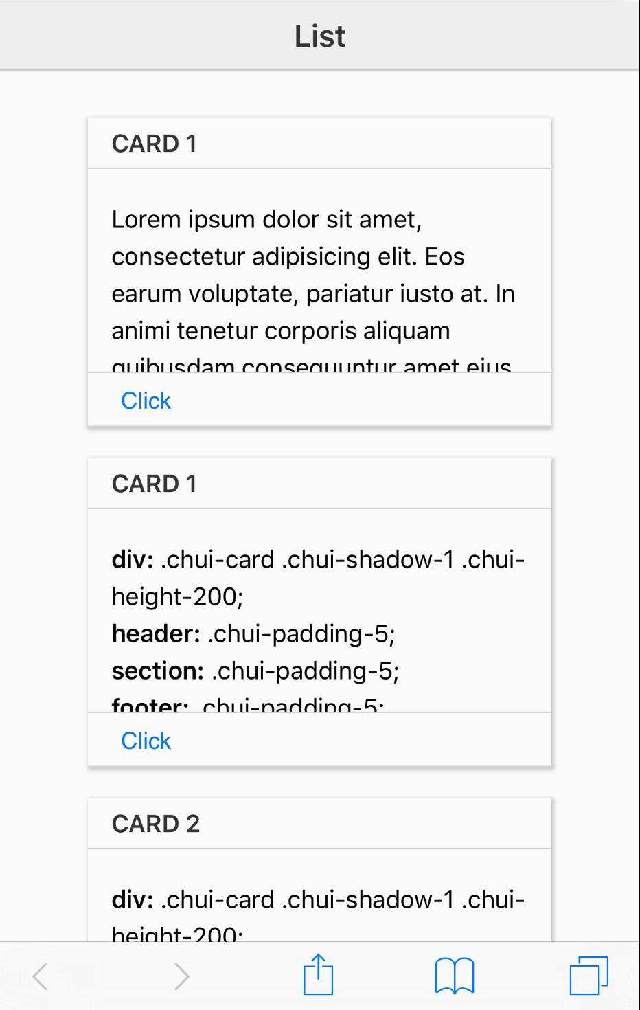
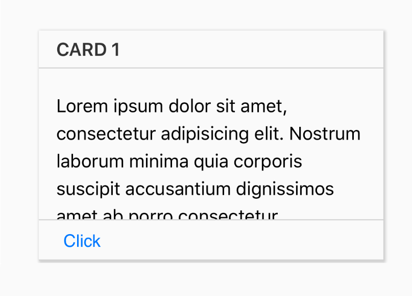
Cards provide a simple and consitent interface for displaying chuncks of data. Cards automatically stack their content up vertically. It's like a card. You can give a card a header and a footer, or neither. The content of a card is always contained in a section tag. You should always put your content in a section tag because in the context of a card, the section that will provide automatic vertical scrolling when the content is more than can fit in the height of the card. Below is the simplest possible card with a header, section and footer:
<div class="chui-card">
  <header>
    <h2>Card 1</h2>
  </header>
  <section>
    <p>Lorem ipsum dolor sit amet, consectetur adipisicing elit. Eos earum voluptate, pariatur iusto at. In animi tenetur corporis aliquam quibusdam consequuntur amet eius vero molestiae, repellat sunt, rerum incidunt quia.</p>
  </section>
  <footer>
    <button>Click</button>
  </footer>
</div>
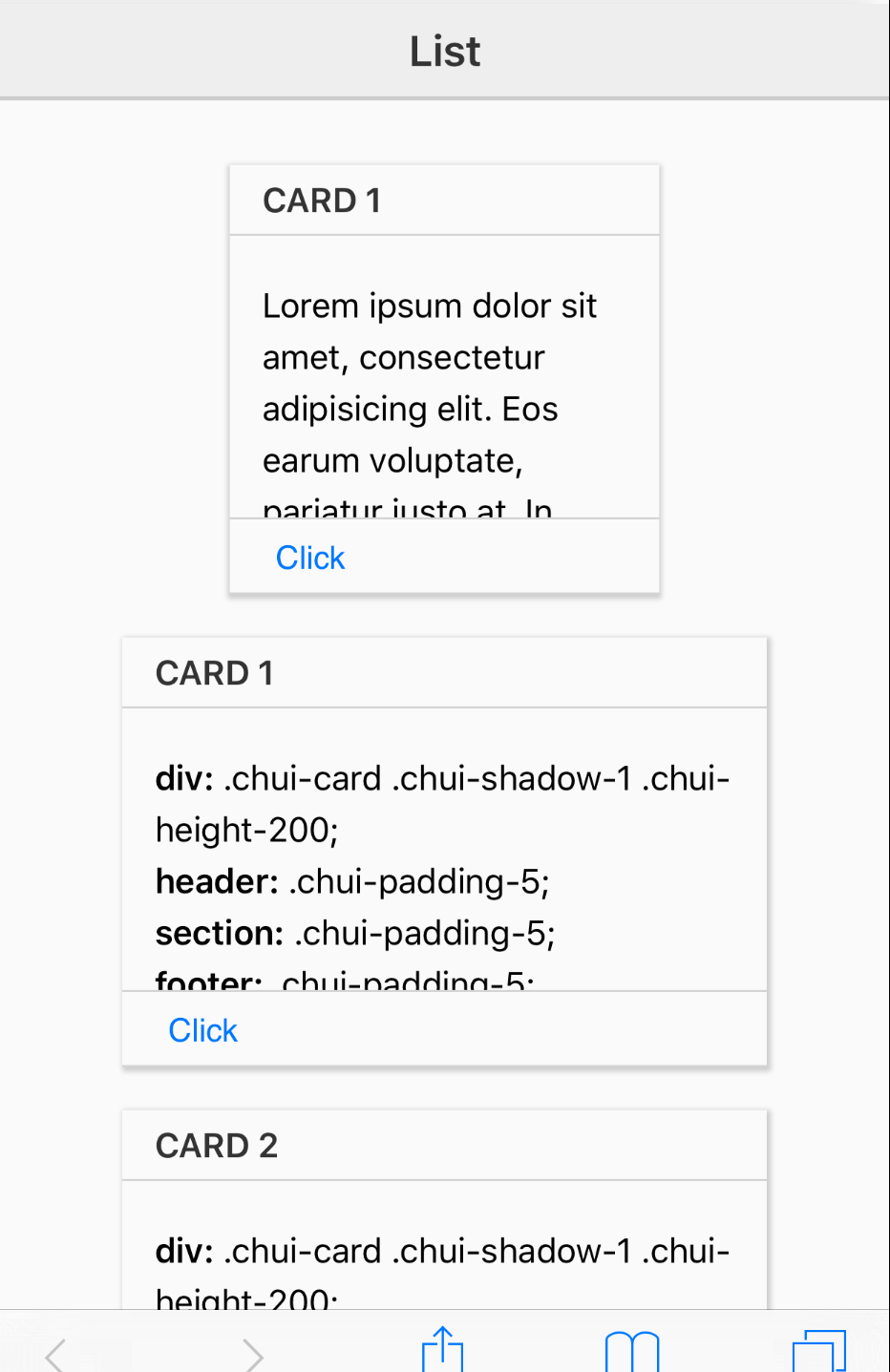
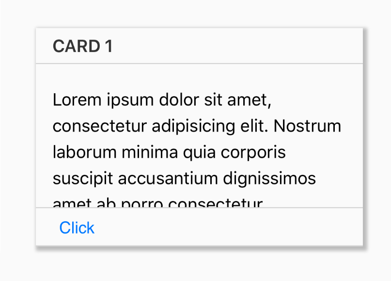
Borders
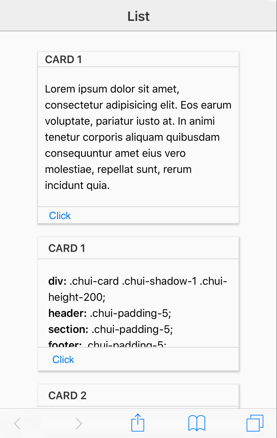
You can spice up your cards with various classes. There are classes that provide common values for many CSS properties, such as height, width, padding, margin, background-color and box shadow. In the above card everything looks like its just sitting together in the same space. We can provide some clarity about the parts of the card by giving the header and footer a border. To do this we can use the classes chui-border-top and chui-border-bottom on the header and footer respectively.
<div class="chui-card">
  <header class="chui-border-bottom">
    <h2>Card 1</h2>
  </header>
  <section>
    <p>Lorem ipsum dolor sit amet, consectetur adipisicing elit. Eos earum voluptate, pariatur iusto at. In animi tenetur corporis aliquam quibusdam consequuntur amet eius vero molestiae, repellat sunt, rerum incidunt quia.</p>
  </section>
  <footer class="chui-border-top">
    <button>Click</button>
  </footer>
</div>
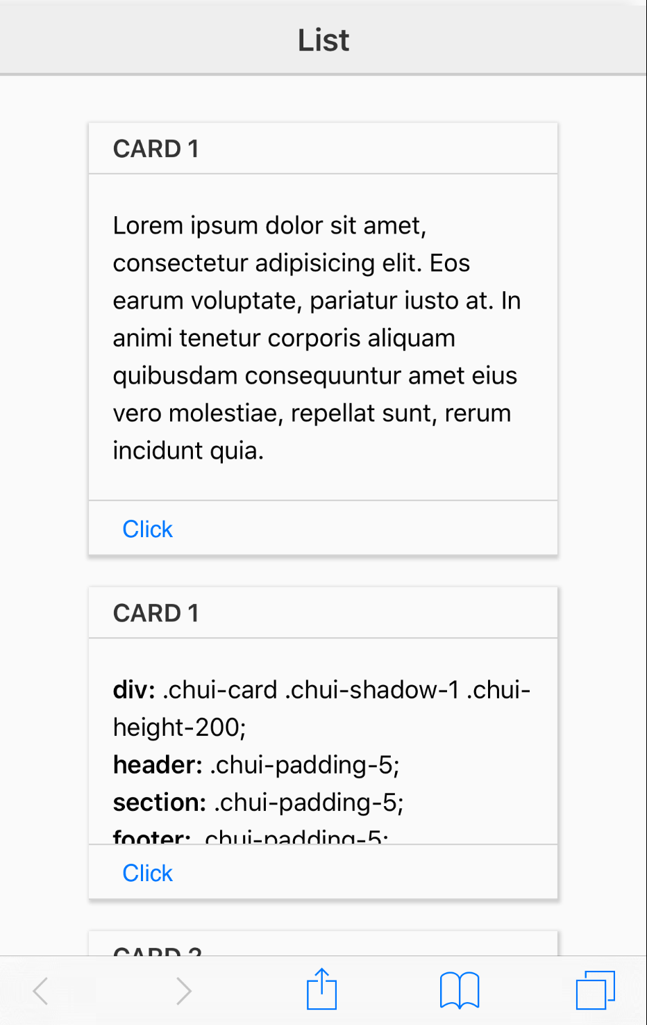
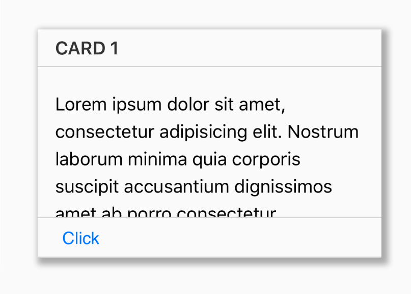
Padding
As you can see, this gives us some separation, but the areas of the card feel cramped. We need some space. For that we can use the padding classes: chui-padding-0. These values start a zero and increase by 5 upto to 20. This version of padding classes adds equal padding to all sides:
.chui-padding-0
.chui-padding-5
.chui-padding-10
.chui-padding-15
.chui-padding-20
If you want less padding above and more on the sides, use these classes:
.chui-padding-0-10
.chui-padding-0-20
.chui-padding-5-10
.chui-padding-5-20
.chui-padding-10-20
.chui-padding-15-30
If you need some other padding that you can reuse on your cards, just define a new class with the padding you need and add it to your apps CSS. Then use the new class on your card or its elements:
.chui-padding-10-100 {
  padding: 10px 100px !important;
}
.chui-padding-10-auto {
  padding: 10px auto !important;
}
Note: As we did above with custom padding classes, you can define any new classes you need to provide any other styles for reuse in your cards. You are not limited by the ones provied by ChocolateChip-UI.
So, lets add some padding to our card:
<div class="chui-card">
  <header class="chui-border-bottom chui-padding-5">
    <h2>Card 1</h2>
  </header>
  <section class='chui-padding-5'>
    <p>Lorem ipsum dolor sit amet, consectetur adipisicing elit. Eos earum voluptate, pariatur iusto at. In animi tenetur corporis aliquam quibusdam consequuntur amet eius vero molestiae, repellat sunt, rerum incidunt quia.</p>
  </section>
  <footer class="chui-border-top chui-padding-5">
    <button>Click</button>
  </footer>
</div>
Height
Next we're going to had a fixed height for our cards. Without a designated height, the card would expand infinitely to accomodate its content. The whole point of cards is that provide stardized areas for displaying content. We can set the height of a card with card classes:
.chui-height-100
.chui-height-150
.chui-height-200
.chui-height-250
.chui-height-300
.chui-height-350
.chui-height-400
.chui-height-450
.chui-height-500
If the provided heights don't work for you, create your own class with the height you need. Now we'll set our cards height to 200:
<div class="chui-card chui-height-200">
  <header class="chui-border-bottom chui-padding-5">
    <h2>Card 1</h2>
  </header>
  <section class='chui-padding-5'>
    <p>Lorem ipsum dolor sit amet, consectetur adipisicing elit. Eos earum voluptate, pariatur iusto at. In animi tenetur corporis aliquam quibusdam consequuntur amet eius vero molestiae, repellat sunt, rerum incidunt quia.</p>
  </section>
  <footer class="chui-border-top chui-padding-5">
    <button>Click</button>
  </footer>
</div>
Now that the card has a fixed height, the content in the section tag is scrollable.
Width
We can also set the width of our card. Setting height and width allows use to easily assemble cards into oraganized grids of items.
The width classes are:
.chui-width-200
.chui-width-250
.chui-width-300
.chui-width-350
.chui-width-400
.chui-width-450
.chui-width-500
.chui-width-550
.chui-width-600
We'll constain the width of our card to 200 pixels with the class chui-width-200:
<div class="chui-card chui-height-200 chui-width-200">
  <header class="chui-border-bottom chui-padding-5">
    <h2>Card 1</h2>
  </header>
  <section class='chui-padding-5'>
    <p>Lorem ipsum dolor sit amet, consectetur adipisicing elit. Eos earum voluptate, pariatur iusto at. In animi tenetur corporis aliquam quibusdam consequuntur amet eius vero molestiae, repellat sunt, rerum incidunt quia.</p>
  </section>
  <footer class="chui-border-top chui-padding-5">
    <button>Click</button>
  </footer>
</div>
Background Color
We can also give a card or elements of a card background colors. ChocolateChip-UI provides a number of useful ones, but you can always define your own class with the specific background colors you want.
.chui-bc-dark rgba(0,0,0,0.05)
.chui-bc-darker rgba(0,0,0,0.1)
.chui-bc-lite rgba(255,255,255,0.15)
.chui-bc-liter rgba(255,255,255,0.25)
.chui-bc-red (#FF0000)
.chui-bc-blue (#0000ff)
.chui-bc-green (#0f7002)
.chui-bc-orange (#ff8000)
.chui-bc-yellow (#f7f701)
.chui-bc-pink (#ff00ff)
.chui-bc-tan (#c7a679)
.chui-bc-lime (#22ff08)
.chui-bc-purple (#6c006c)
.chui-bc-lavender (#e0dff8)
.chui-bc-gold (#fed009)
.chui-bc-sky-blue (#66ccff)
.chui-bc-black (#000000)
.chui-bc-white (#ffffff)
.chui-bc-ivory (#ffffed)
.chui-bc-gray (#6d6d6d)
.chui-bc-charcoal (#333333)
.chui-bc-brown (#942f01)
.chui-bc-teal (#0e6e6c)
.chui-bc-violet (#9a42ea)
.chui-bc-olive (#6d6f03)
.chui-bc-moss (#40652f)
Try out different background color classes on the card, header, section and footer to see what works for you.
We're going to add some colors to the header, section, footer and button in the footer. We'll use chui-bc-green on the header, chui-bc-ivory on the section, chui-bc-gold on the footer and chui-bc-green on the button in the footer.
<div class="chui-card chui-height-200 chui-width-200">
  <header class='chui-border-bottom chui-padding-5 chui-bc-green'>
    <h2>Card 1</h2>
  </header>
  <section class='chui-padding-5 chui-bc-ivory'>
    <p>Lorem ipsum dolor sit amet, consectetur adipisicing elit. Eos earum voluptate, pariatur iusto at. In animi tenetur corporis aliquam quibusdam consequuntur amet eius vero molestiae, repellat sunt, rerum incidunt quia.</p>
  </section>
  <footer class='chui-border-top chui-padding-5 chui-bc-gold'>
    <button class="chui-bc-green">Click</button>
  </footer>
</div>
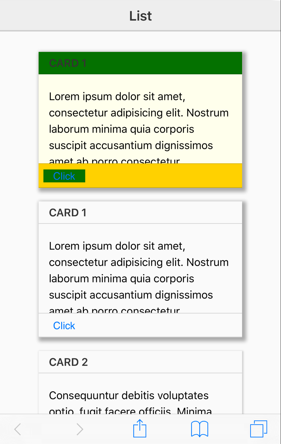
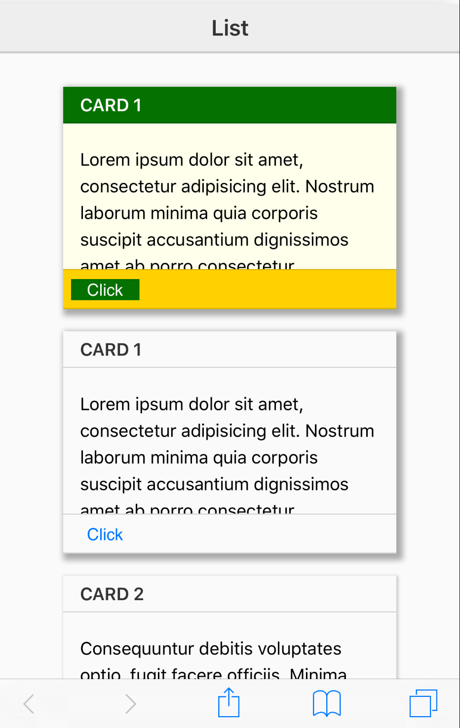
Text Color
As you can see, the text of the header and button are hard to read because of the background color. We can fix that using a card color class. These are the defaults:
.chui-c-lite
.chui-c-dark
We'll use chui-c-lite on h1 in the header and button to make them easier to read.
<div class="chui-card chui-height-200 chui-width-200">
  <header class='chui-border-bottom chui-padding-5 chui-bc-green'>
    <h2 class='chui-c-lite'>Card 1</h2>
  </header>
  <section class='chui-padding-5 chui-bc-ivory'>
    <p>Lorem ipsum dolor sit amet, consectetur adipisicing elit. Eos earum voluptate, pariatur iusto at. In animi tenetur corporis aliquam quibusdam consequuntur amet eius vero molestiae, repellat sunt, rerum incidunt quia.</p>
  </section>
  <footer class='chui-border-top chui-padding-5 chui-bc-gold'>
    <button class="chui-bc-green chui-c-lite">Click</button>
  </footer>
</div>
Background Image
ChocolateChip-UI does not have class for background images, but it is easy to make one. You can make a class to add a background image to the card itself or any of its elements. In the image below you can see a card with a background image on its header and another card with a background image on the card itself so that it shows there on all content:
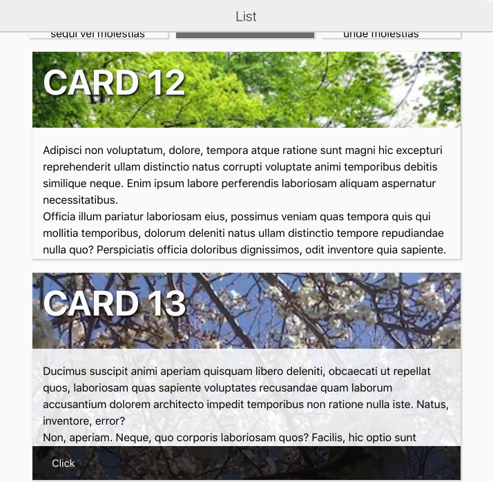
Here are the classes we made to handle that:
.card-12 > header {
  background: transparent url(../images/myPictures/germany-70567_640.jpg) no-repeat;
  background-size: 100% auto;
}
.card-12 h2 {
  font-size: 30pt;
  font-weight: bold;
  text-shadow: 2px 2px 4px #000;
}

.card-13 {
  background: transparent url(../images/pics/pic-01.jpg) no-repeat;
  background-size: 100% auto;
}
.card-13 h2 {
  font-size: 30pt;
  font-weight: bold;
  text-shadow: 2px 2px 4px #000;
}
.card-13 > section {
  background-color: rgba(255,255,255,0.85);
}
And here is the markup for those two cards:
<div class="card-12 chui-card chui-shadow-1 chui-height-250 chui-width-600">
  <header class='chui-padding-5'>
    <h2 class='chui-c-lite'>Card 12</h2>
  </header>
  <section class='chui-padding-5'>
    <p>Lorem ipsum dolor sit amet, consectetur adipisicing elit. Ut modi nulla soluta minus ex atque cupiditate excepturi exercitationem ad accusamus consequuntur architecto autem omnis officiis, quidem harum, nam minima voluptate?</p>
  </section>
</div>

<div class="card-13 chui-card chui-shadow-1 chui-height-250 chui-width-600">
  <header class='chui-padding-5'>
    <h2 class='chui-c-lite'>Card 13</h2>
  </header>
  <section class='chui-padding-5'>
    <p>Lorem ipsum dolor sit amet, consectetur adipisicing elit. Ut modi nulla soluta minus ex atque cupiditate excepturi exercitationem ad accusamus consequuntur architecto autem omnis officiis, quidem harum, nam minima voluptate?</p>
  </section>
  <footer class='chui-border-top chui-padding-20 chui-bc-transparent-gray'>
    <button class='chui-c-lite'>Click</button>
  </footer>
</div>
Margins
You can also use margin classes on cards or card elements. The following classes are avaiable:
.chui-margin-0
.chui-margin-10-5
.chui-margin-10-6
.chui-margin-5
.chui-margin-10
.chui-margin-15
.chui-margin-20
.chui-margin-5-6
.chui-margin-5-10
.chui-margin-5-15
.chui-margin-5-20
.chui-margin-10-15
.chui-margin-10-20
Box Shadow
And finally, there are classes for box shadows. These can help make your cards pop off the page with some dimension. The following classes are avaiable:
.chui-shadow-1 (1px 1px 2px 1px #ccc)
.chui-shadow-2 (2px 2px 4px 2px #bbb)
.chui-shadow-3 (3px 3px 6px 3px #aaa)
If you really want a more dramatic box shadow, simply derine your own class.
.chui-shadow-1
.chui-shadow-2
.chui-shadow-3
Responsive
Cards have responsive behavior built in. So if you use or define a class with a longer width than can fit on a cell phone in portrait mode, the card will be resized to fit the screen.
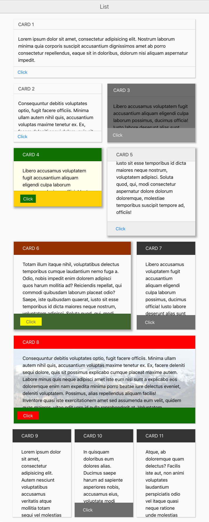
Examples
Here are a number of cards defined with the default classes and in some cases a background image applied.