Docs
Everything You Need to Know
Components
API
Component
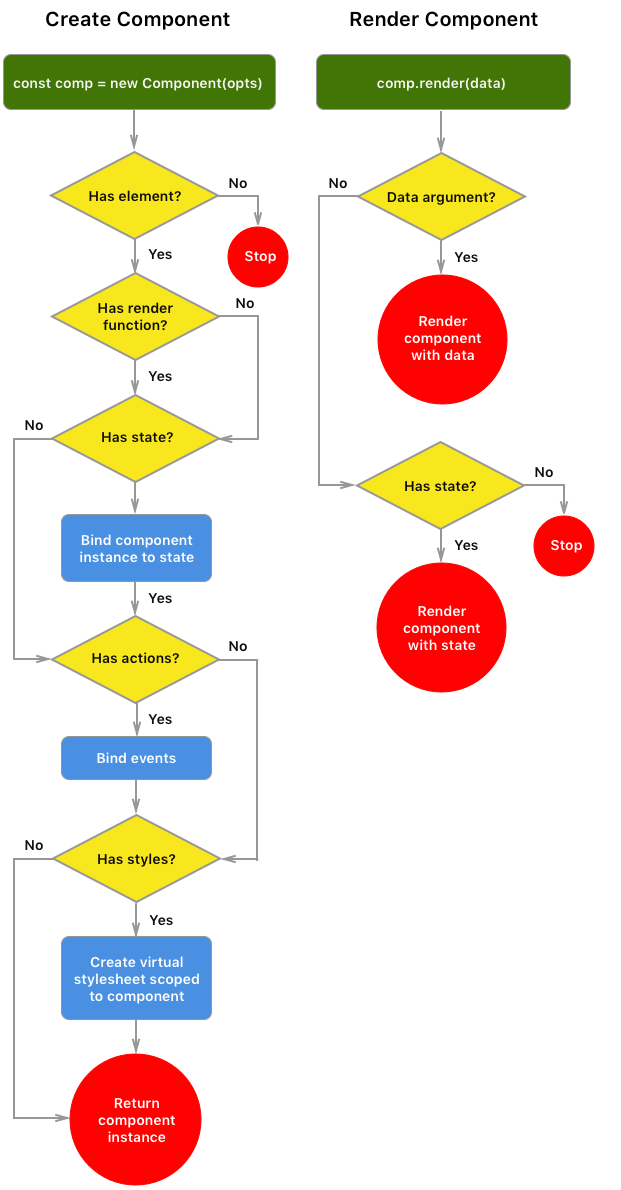
The following diagram illustrates the lifecycle of a component from instantiation to rendering. After instantiation, a component can be rendered by a change to the state it is bound to or by the render function on the component instance.
new Component(options)
Components can be initialized with the following options:
- element: The element that the component will use as a temlate parent. The template will be rendered inside of this element.
- render: A function that returns a template literal defining the component's template.
const myComponent = new Component({
  element: '#arrayTemplate1',
  render: (stuff) => html`
    <li>
      ${stuff}
    </li>`
});
And here's the same render function using JSX:const myComponent = new Component({ element: '#arrayTemplate1', render: (stuff) => ( <li> {stuff} </li> ) }); - state: A State object. This will bind the component to the designated State object. Binding a component to a State object means that when the state changes, the component will get updated automatically.
- actions: This is an array of objects defining user interaction. Each object consists of an event, and element and a callback. If you want to target the parent element, leave out the `element` property or using `self` as its value. Otherwise, any element will have its event delegated by the component element. The
callbackdefines what should happen when the event occurs:const myComponent = new Component({ element: '#arrayTemplate1', state: MyState, render: (stuff) => html` <li> ${stuff} </li>`, actions: { element: 'li', event: 'tap', callback: function() { console.log($(this).text()) } } });Handing
thisThere can hardly be a discussion of JavaScript with understand its implementation of
this. An action's callback will handle this differently depending on how you implement the callback. If you write the callback using normal function conventions,thiswill refer to the element that received the event. But if you write the callback using an ES6 arrow function, this will refer to the scope of the callback. If you want to access the interacted element in an arrow function, you can do so through the event target. Below are two action callbacks doing the same thing, one written with a default function and one with an arrow function:const myComponent = new Component({ element: '#arrayTemplate1', ... // Callback with normal function. // "this" is the element tapped: actions: { element: 'li', event: 'tap', callback: function() { console.log($(this).text()) } } ... // Instead of the function used above, we can // define the callback with an arrow function. // Notice how we access the element thorough // the event target: actions: { element: 'li', event: 'tap', callback: (e) => console.log($(e.target).text()) } });Event Bubbling in Components
You can use the
bubbleproperty with its value set totruein an event object to designate that the event should bubble. Most of the time you should not need to do this. By default this value is always false. The bubble value is only required when you want the event to pass through and be captured by the event target parent elements.Unbinding an Action Event
If you need to unbind an event created by a component's action, you can use the
$(selector).off()method to do so. Provide the component'selementas the selector, then the event type and callback if you used a named one. Read more about how to unbind events. - styles: This property takes an object defining styles for your component. In most cases you won't need to use it since the default styles will work fine. However, if you want to customize the look of your component, you can use this propertly to create a vitual stylesheet for it. The styles will be defined off of the element selector you anchor your component to using the
elementproperty. The style object looks like this:const myComponent = new Component({ element: '#itemsList', styles: { // Style the list itself: border: 'solid 1px red', // Style the component's child elements: '> li': { 'background-color': 'red' } } });This will create a stylesheet like this:
#itemsList {
  border: solid 1px red;
}
#itemsList > li {
  background-color: red;
}
To learn more about defining styles for a component, please read the documentation.
Data Binding with State
When you designate a State object for your component, as we did above, the component is bound to it. This means that whenever you use the state's methods to change its data, the component will automatically refresh to show those changes. Read the documentation for State to learn more about create a State object.
State Methods that Trigger Component Refresh
The following state methods will trigger a fresh of a bound component:
Object State
- set
- merge
- mixin
- remove
Array State
- push
- pop
- unshift
- shift
- setPropAt
- splice
- insert
- reverse
- sort
- orderBy
- concat
- mixin
- unique
If you want to perform one of these state methods but don't want the component to update at that time, you can pause the State object and have it update the component later. Read more about that here.
Component Methods
render
render(data, append)
The render method will render a template. If it is bound to a state, it will render the component's template with that state:
// Render a component:
myComponent.render();
Or you can render a component with raw JavaScript data:
// Render a component:
myComponent.render(myData);
When rendering a component, the current content is replaced with the data available at render time. You can choose to have the render append the its content to the current content of the component. If you wish to append content to a component that uses a collection, make sure the content you're rendering is new, otherwise you'll have unnecessary duplicates.
To append content to a rendered component, add the keyword true as the last argument:
// Append to a component:
myComponent.render(myData, true);
empty
empty()
Running this method on a component will remove all rendered content from the parent element.
// Empty a component:
myComponent.empty();
setTemplate
setTemplate(template)
You can use this method to change the template that a component's render function is using. It expects a template literal or tagged template literal.
This method allows you to totally change how the component is rendering.
// Set a component's template:
const newTemplate = (data) => html`
  <li>
    <h3>${data}</h3>
  </li>`;

myComponent.setTemplate(newTemplate);

// Render component to update it:
myComponent.render(data)
After changing the render function template that a component uses, you'll need to render the function to update. Be aware that the new template should work with whatever data the component is using.
setState
setState(myState)
If you have initialized your component with raw JavaScript data and want to switch to using a component, you use this method. It takes one argument, the state you want the component to use. After binding the component to the state, any changes to the state will trigger a refresh of the component with the state changes.
You can also use this method to dynamically change what state a component is currently using. This method automatically unbinds any previously bound state before binding the new one. After changing the bound state, you can immediate update the component using its render method:
import {defaultState} from './data/defaultState'
import {newState} from './data/newState'
// Define component:
const listComponent = new Component({
  element: '#list',
  render: (data) => html`
    <li>${ data }</li>`,
  state: defaultState
})
// Render component with default state object:
listComponent.render()

// Change component's state object and render:
listComponent.setState(newState)
listComponent.render()
mount
mount()
This method is for use with ES6 modules. If you have your components defined in separate files and import them into your app to use, you'll need to mount them before rendering. When you import a component from an external file, because this happens before the DOM is thoroughly loaded, ChocolateChip-UI is not able to find the component's element or bind any events that it has. To get around this problem, after importing a component you need to mount it. Mounting should always be done inside a DOM load function. Mounting a component tells it to look for its element and bind any events that it has. After mounting, a component will function as expected.
import {myComponent} from '../components/myComponent';
app(() => {
  // Mount the component and render it:
  myComponent.mount();
  myComponent.render();
});
unmount
unmount()
This method is used to empty a component and remove any actions (events) that might be registered. You want to unmount a component before removing its root element from the DOM. The following example show how to do that:
app(() => {
  // unmount component:
  myComponent.unmount();
  // Delete component root element:
  myComponent.root.remove();
});
styles
styles: {styleObject}
You can define styles on your component that create a virtual stylesheet. You would do this to override existing styles, style some custom layout in your component or create a styled component that you can re-use in different projects. The styles are based off of the selector you provide when you create the component. When you use setElement to change which element your component is anchored to, ChocolateChip-UI will re-create the virtual stylesheet using the new element selector.
Please note that if you define styles for your component and then want to change templates, your styles may not work with the new template. If you need to be able to change a component's templates dynamically, then don't bother defining its styles with this property. But the styles in your app's stylesheet instead.
To learn more about defining styles for a component, please read the documentation.
Lifecycle Methods
As of version 5.2.0, while defining a component, you can take advatage of the following lifecycle methods. There are three pairs. Two for when mounting an imported component. Two for when unmounted a component. And two for when rendering a component.
- componentWillMount - Use this when importing and mounting a component with
mount(). It will execute before the component is mounted. - componentDidMount - use this when importing and mounting a component with
mount(). It will execute after the component is mounted. - componentWillUnmount - use this when running
unmount()on a component. It will execute before the component is unmounted. - componentDidUnmount - use this when running
unmounted()on a component. It will execute after the component is unmounted. - componentWillUpdate - use this when running
render()on a component. It will execute before the component is rendered. - componentDidUpdate - use this when running
render()on a component. It will execute after the component is rendered.
Mounting:
Unmounting:
Rendering:
These methods allow you to perform tasks at different times during the lifecycle of a component. You set them up during the initialization of a component:
// file /components/list.js
export const list = new Component({
  element: '#list',
  render: (fruit) => (
    <li>
      <h3>${fruit.name}</h3>
    </li>
  ),

  componentDidMount: () => console.log('The component was imported and mounted. That means you can render it.'),

  componentDidUpdate: () => announcement.render('This is a footer for a recently rendered list component')
  }
})
// file /app.js
import {list} from './components/list'
import {fruits} from './data/fruits'

app(() => {
  // Mounting causes the componentDidMount method to execute:
  list.mount()
  // Rendering casues the componentDidUpdate method to execute:
  list.render(fruits)
})