Docs
Everything You Need to Know
Layouts
Use
As explained in the intro, your app consists of a series of ui-screens. Within the ui-screens you create the layout structure for your app. A ui-screen can contain any of four elements: nav, section, toolbar, footer. Every ui-screen must have a section. This is absolutely required for the content to be accessible. The section tag inside a ui-screen creates a vertial scroller. A ui-screen stacks its elements vertically, one on top of the other, so order is important: nav first, followed by section, followed by optional toolbar or footer. You would at least have a nav and section in every ui-screen. OK, you can leave out a nav if you absolute must have maximum ui-screen real estate, however, you must then provide something to allow the user to get out of that ui-screen.
ChocolateChip-UI uses h1-h5 for semantic purposes. An h1 is always in the navigation bar and serves as the title for that ui-screen. An h2 is put before a list and serves as the list's title. h3 are used inside lists as the title of a list item. And h4 are using inside lists as the subtitle of a list item. Putting a paragraph tag after a list creates a footnote for the list. Or you can use the summary tag directly after a list for the same purpose.
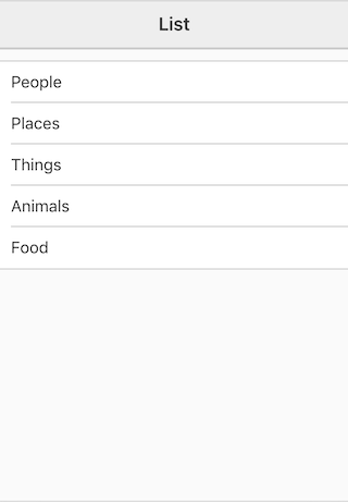
Lists are created with unordered lists. Just put the class "list" on it and it will be displayed as a proper list. Otherwise it will appear as a normal bulleted list. Lists constitute the principal way that you will create layouts.
Simple List
To create a simple list, just put an h3 into a list item:
<ul class='list'>
  <li>
    <h3>One</h3>
  </li>
  <li>
    <h3>Two</h3>
  </li>
  <li>
    <h3>Three</h3>
  </li>
</ul>
This would give us a layout like this:
You can add subtitles to the list by including h4s:
<ul class='list'>
  <li>
    <h3>One</h3>
    <h4>Subtitle One</h4>
  </li>
  <li>
    <h3>Two</h3>
    <h4>Subtitle Two</h4>
  </li>
  <li>
    <h3>Three</h3>
    <h4>Subtitle Three</h4>
  </li>
</ul>
Notice that by default these are aligned horizontally to the left and right. If you want them stacked, you need to put them in a div. In fact you can create various columns of stakced content using divs inside a list item:
<ul class='list'>
  <li>
    <div>
      <h3>One</h3>
      <h4>Subtitle One</h4>
    </div>
  </li>
  <li>
    <div>
      <h3>Two</h3>
      <h4>Subtitle Two</h4>
    </div>
  </li>
  <li>
    <div>
      <h3>Three</h3>
      <h4>Subtitle Three</h4>
    </div>
  </li>
</ul>
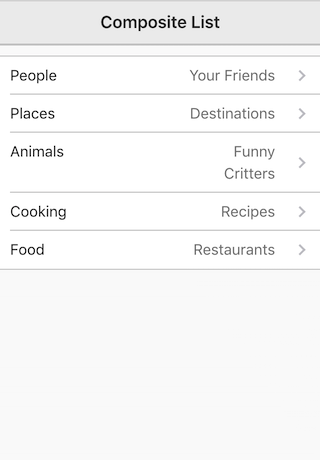
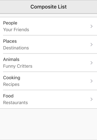
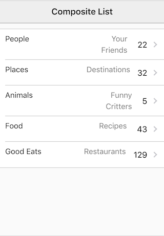
Navigation Lists
To make a list look like it's navigable you need to include navigation disclosures in the list items:
<li>
  <h3>Things</h3>
  <aside>
    <disclosure></disclosure>
  </aside>
</li>
The list will look like this:

If we take the h3 and h4 together with a navigation disclosure, we get this:
<li='people'>
  <h3>People</h3>
  <h4>Your Friends</h4>
  <aside>
    <disclosure></disclosure>
  </aside>
</li>
If we want the h3 and h4 stacked, we put them in a div, followed by the disclosure:
<li='people'>
  <div>
    <h3>People</h3>
    <h4>Your Friends</h4></div>
  <aside>
    <disclosure></disclosure>
  </aside>
</li>
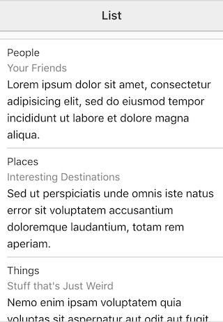
List Detail
To include a detail along with the list item's title and subtitle, we use a paragraph tag:
<li>
  <div>
    <h3>Places</h3>
    <h4>Interesting Destinations</h4>
    <p>Sed ut perspiciatis unde omnis iste natus error sit voluptatem accusantium doloremque laudantium, totam rem aperiam, eaque ipsa quae ab illo inventore veritatis et quasi architecto beatae vitae dicta sunt explicabo.</p>
  </div>
</li>
Columns
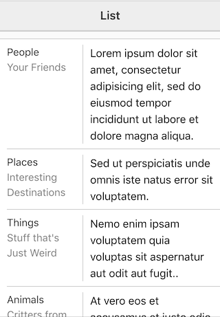
You can create columns inside a list item by including two divs. Please make sure that your target devices are wide enough to accomodate this type of layout. You can visually separate the two columns by putting a class "separator" on the second div. By default both columns will be the same width. Depending on what your content is, this may not work. You can change that behavior by putting a class "no-flex" on a div, as we did below. then in the stylesheet for the app we added a CSS definition to makes the first column only 100 pixels width:
<li>
  <div class='no-flex'>
    <h3>People</h3>
    <h4>Your Friends</h4>
  </div>
  <div class='separator'>
    <p>Lorem ipsum dolor sit amet, consectetur adipisicing elit, sed do eiusmod tempor incididunt ut labore et dolore magna aliqua.</p>
  </div>
</li>
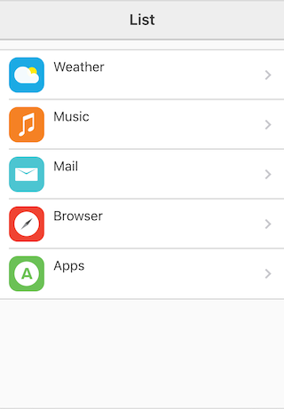
Icons in List Items
You can use a span to display icons in your list items. Just you a span with the name icon and provide a syle for it. In the example below we give each icon span a secondar name so we can define its image in the stylesheet:
<li>
  <span class='icon weather'></span>
  <h3>Weather</h3>
  <aside>
    <disclosure></disclosure>
  </aside>
</li>
<li>
  <span class='icon music'></span>
  <h3>Music</h3>
  <aside>
    <disclosure></disclosure>
  </aside>
</li>
<li>
  <span class='icon mail'></span>
  <h3>Mail</h3>
  <aside>
    <disclosure></disclosure>
  </aside>
</li>
Here's what the styles look like:
.icon {
  display: block;
  height: 40px;
  width: 40px;
  margin-right: 10px;
  background-repeat: no-repeat;
  background-position: center center;
  background-size: auto 70%;
}
.icon.weather {
  background-color: #29abe2;
  background-image: url(../images/app-icons/weather.png);
  background-size: 70% auto;
}
.icon.mail {
  background-color: #52c5d0;
  background-image: url(../images/app-icons/mail.png);
  background-size: 70% auto;
}
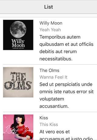
Images in List Items
You can include an image in a list item. Just make it the first item in the list. Put all the other content, h3, h4 and p tags, into a div after it:
<li>
  <img title='iTunes' src="../images/music/Kiss.jpg" height='100px'>
  <div>
    <h3>Kiss</h3>
    <h4>This Kiss</h4>
    <p>At vero eos et accusamus et iusto odio dignissimos ducimus qui blanditiis praesentium voluptatum deleniti atque corrupti quos dolores et quas molestias excepturi sint occaecati cupiditate non provident.</p></div>
</li>
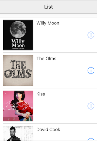
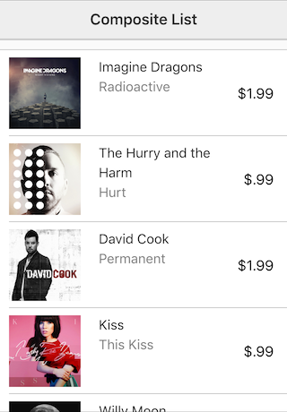
Information Indicator
Besides navigation indicators, sometimes you want to alert the user that tapping a list item will show them more detail about the item. You do this using the info tag in an aside as the last element in the list item:
<li>
  <img title='Blues' src="../images/music/Willy Moon.jpg" height='100px'>
  <h3>Willy Moon</h3>
  <aside>
    <info></info>
  </aside>
</li>
Showing a Price
If you wanted to show a price, put the class "price" on the aside, and a span to hold the price:
<li>
  <img title='Permanent' src="../images/music/Permanent.jpg" height="80px">
  <div>
    <h3>David Cook</h3>
    <h4>Permanent</h4>
  </div>
  <aside class='price'>
    <span>$1.99</span>
  </aside>
</li>
Date and Time
You show a date or time by putting those classes on the aside and including the data in a span tag:
<li>
  <div>
    <h3>Places</h3>
    <h4>Interesting Destinations</h4>
  </div>
  <aside class='date'>
    <span>3/14/10</span>
    <disclosure></disclosure>
  </aside>
</li>
<li>
  <div>
    <h3>Funny Animals</h3>
    <h4>Unusual Critters</h4>
  </div>
  <aside class='time'>
    <span>12:30 PM</span>
    <disclosure></disclosure>
  </aside>
</li>
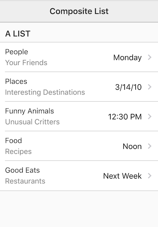
Numbers
You display numbers by putting the "number" class on an aside and putting the number in a span tag:
<li>
  <h3>Food</h3>
  <h4>Recipes</h4>
  <aside class='number'>
    <span>43</span>
    <disclosure></disclosure>
  </aside>
</li>
Style the List Headers
By default, when you put an h2 before a list as its header, it gets style uppercase and it wraps around. Instead it gets cut off with ellipses. You can change this to suit your needs with some list header-specific classes.
Normal Case
By putting the class "normal-case" on a h2, it will display the default case of the text.
No Wrap
If you would prefer that your list headers did not wrap, but were cut off with ellipsis as is common on mobile devies, you can add the class "no-wrap" to the h2.
Check out all the examples of layouts in the source code from Github. there in a folder called layouts in the examples folder.