Docs
Everything You Need to Know
Themes
Use
ChocolateChipJS provides three themes: Android, iOS and Windows Phone. These use the default colors for each. In most cases this may be fine for what you are building. However, if you need color for branding purposes, you can add a few styles to a style tag in your app's header.
Customize the Colors of a Theme
When colorizing your app, there is one thing to keep in mind, readability. If you color the navigation bar and toolbar with a dark color, you will need to color the text and widget indicators in them so that they stand out from the background color. So, in the case of a light color in the navigation and tool bars, you'd be fine. But if you gave them a dark red, you'd need to make their content lighter so that you can see them.
Coloring Nav Bars
If you intend to colorize your app's nav bars and your app is using navigation lists, you need to also make sure that you include the #globalNav selector. If you do not have navigation lists in your app, you do not need this feature. To create the global nav bar, just set the $.globalNav property to true as the first entry in your DOM ready function:
$(function() {
  $.globalNav = true;
  // You other code here
});
To see how to style this global nav bar, examine the styles below. It's always right after the nav selector. Remember, you only need the global nav bar if you are using navigation lists in your app.
iOS
In the following example, we'll give the navigation and toolbars a light blue color and make the titles and buttons in them a dark charcoal:
/* Color navbar, globalNav and toolbar */
nav, #globalNav, screen > footer, screen > toolbar {
  background-color: #9fc5e8;
}
/* Color title and buttons in nav and toolbars */
nav h1, nav button, toolbar button, footer button, nav .back, #chui-back-arrow  {
  color: #333 !important;
  stroke: #333 !important;
}
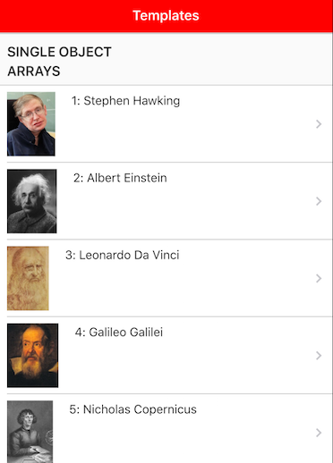
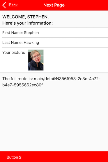
Now if we want to use a darker background color on the nav and toolbars, we would need to lighten up the button in them as well, setting them to #fafafa:
/* Color navbar, globalNav and toolbar */
nav, #globalNav, screen > footer, screen > toolbar {
  background-color: red;
}
/* Color title and buttons in nav and toolbars */
nav h1, nav button, toolbar button, footer button, nav .back, #chui-back-arrow  {
  color: #fafafa !important;
  stroke: #fafafa !important;
}
For a more complete example of how to customize the colors of your app, get all the examples (Read instructions to get the examples). Once you have the examples, open the folder and look for customized themes. It should be the first folder. Open that and look in the iOS folder. You'll find a css folder and in it you'll find to customized color schemes. One is red, like the example above. It is complete. You can copy/paste it into your app and then just search and replace "red" with whatever color you want. This version expects a darker color, so it has the text light on the color backgrounds. There is also a blue theme. This is a light blue, so the text over blue is dark. Use this theme as the starter for a customization where the color is lighter.
Android
Colorizing the Android theme works the same as iOS:
/* Color navbar, globalNav and toolbar */
nav, #globalNav, screen > footer, screen > toolbar {
  background-color: #9fc5e8;
}
/* Color title and buttons in nav and toolbars */
nav h1, nav button, toolbar button, footer button, nav .back, nav .backTo, #chui-back-arrow  {
  color: #333 !important;
  stroke: #333 !important;
}
/* Color segmented control marker */
span.androidSelectionBorder {
  border-bottom: solid 3px #9fc5e8;
}
And here we have the same dark red background for Android:
/* Color navbar, globalNav and toolbar */
nav, #globalNav, screen > footer, screen > toolbar {
  background-color: red;
}
/* Color title and buttons in nav and toolbars */
nav h1, nav button, toolbar button, footer button, nav .back, #chui-back-arrow  {
  color: #fafafa !important;
  stroke: #fafafa !important;
}
/* Color segmented control marker */
span.androidSelectionBorder {
  border-bottom: solid 3px red;
}
For a more complete example of how to customize the colors of your app, get all the examples (Read instructions to get the examples). Once you have the examples, open the folder and look for customized themes. It should be the first folder. Open that and look in the Android folder. You'll find a css folder and in it you'll find to customized color schemes. One is red, like the example above. It is complete. You can copy/paste it into your app and then just search and replace "red" with whatever color you want. This version expects a darker color, so it has the text light on the color backgrounds. There is also a blue theme. This is a light blue, so the text over blue is dark. Use this theme as the starter for a customization where the color is lighter.
Material Design
The Android theme is based on the principles of Google's Material Design. When the Android theme is loaded on a mobile device, the typical ripple effects will occur when the user taps a button or interactive list item, showing the user that a tap occurred. ChocolateChip-UI uses a sophisticated color algorithm to determine when the ripple color needs to be dark or light based on the background color of the item being tapped.
Custom Ripple Color
You can also provide a preferred color for the ripple to override the default. To do so, just put the property data-ripple-color with the color you want to use. Ripples will always be rendered a 45% opacity, so setting a ripple color to red would result in a pink ripple. This is for legibility purposes.
<button>Button Default</button>
<button data-ripple-color='red'>Button Red Ripple</button>
If you want to set the ripple color for something in a view, put the value directly in the template. Below we've updated the template to give the list items a blue ripple:
<ul class="list" id="multiSelectList">
  <li data-select="{= data.value}" data-ripple-color="blue">
    <h3>{= data.label }</h3>
  </li>
</ul>
Buttons in Navbars
The code that implements the Android Material Design ripples also checks buttons to see if they are in a navbar. If they are, it checks the navbar's background color and determines the button's ripple color based on this. So, if you customize your Android layouts with colored navbars, any buttons in them will automatically have the correct ripple contrast to show over the navbar. You can, of course, override this by setting a custom color for the ripple with the data-ripple-color attribute.
Color Support
As we mentioned in the section about Android above, ChocolateChip-UI has some dedicated methods for handling colors. These allow you to determine if the text color of a button needs to be darker or lighter depending on the it's background color. You can also programmatically darken or lighten a color, or convert colors between hex and RGB. For more information about these methods, please read the documentation in Utilities.