Docs
Everything You Need to Know
Widgets
Busy
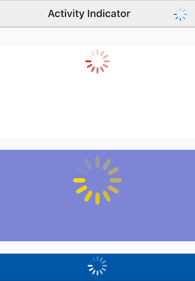
Every platform has a different look for their activity indicators. ChocolateChip-UI offers a busy control that you can use in your app when you begin some task that may take an undeterminable time to complete so the user knows to wait. You can provide a color and a size for the activity indicator. On Android this is a spinning semi-circle, on iOS it is a spinning pronged star.

Importing UIBusy Into Your Project
In order to use UIBusy, you need to import it into your project. So that means you have to have a project created with the chui command line tool. To learn how to create a project, read the documentation. After creating a project, open your project and go the the dev folder. Inside it you will find your project's main JavaScript file: app.js. At the top of that you need to import the UIBusy widget:
import {UIBusy} from './src/widgets/ui-busy'
After importing UIBusy, you can use it as described below.
A busy indicator is injected into another element, its conainer. So, you can show a busy indicator on a screen, a navigation bar, or even in an empty popup. It takes just three arguments: element, color and size. The defaults are 40 pixels by 40 pixels and #666666. You can also run the method center() on the instance to center it. Here are some possible initializations for busy indicators:
const busy1 = new UIBusy({
  element: '#busy1',
  color: 'rgba(200,0,0,0.75)',
  size: 50
})
busy1.center('absolute')

const busy2 = new UIBusy({
  element: '#busy2',
  color: 'gold',
  size: 100
})
busy2.center('absolute')

const busy3 = new UIBusy({
  element: '#busy3',
  color: '#fff',
  size: 50
})
busy3.center('absolute')
Modal Popup
You could also create an empty ui-popup and put a busy indicator in it during a lengthy operation, such as waiting for an Ajax request. In the example below we will automatically close the busy popup after 5 seconds:
const popup = new UIPopup({id: 'busyModal', empty: true, width: 100});
$('#showModalBusyIndicator').on('tap', function(e) {
  const busy = new UIBusy({
    element: '.dialog',
    color: 'red',
    size: 90
  })
  popup.open();
  setTimeout(() => {
    popup.close();
    $('#busyModal').find('.dialog').empty();
  }, 5000);
})
Check out the following files in the examples folder: "activity-indicator.html", "activity-indicator-modal.html". Read the following instructions for getting the examples.
Busy Indicator Example
See the Pen Busy Indicator V5 by Robert Biggs (@rbiggs) on CodePen.
Busy Indicator with Android Theme
See the Pen Busy Indicator Android Theme V5 by Robert Biggs (@rbiggs) on CodePen.