Docs
Everything You Need to Know
Widgets
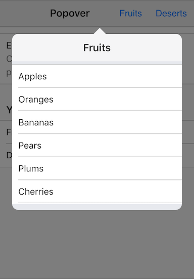
Popover
Popovers are a menu system on mobile devices. Having actual menus doesn't make sense because they are hard targets for the finger. But having a tappable target that can reveal a popover is a useful and satisfying experience for the user.
A popover is just a container into which you can put whatever you want your users to interact with. That might be a list or a set of buttons. What you put there depends on your needs.
Importing UIPopover Into Your Project
In order to make a popover, you'll need to import the UIPopover class class into your project. You do that by by including the following at the top of your app.js file in your project's dev folder:
import {UIPopover} from './src/widgets/ui-popover'
After importing UIPopover, you are ready to create a popover.
To create a popover, you use the following format new UIPopover(options). The options are display in the following example:
const fruitPopover = new UIPopover({
  title: 'Fruits',
  id: 'popoverFruits',
  trigger: '#showPopoverButton',
  content: popoverContent,
  callback: () => popoverEventHandler('fruitsPopover')
})
The title is only displayed on iOS. The trigger, is the element the user interacts with to show the popover. The popover will be displayed relative to the position of the trigger element. The content is a string of markup that will be injected into the popover. As we mentioned earlier, this could be a list, or a series of buttons. Finally we provide a callback. We can use this callback to register a delegated event on the popover to handle user interactions on the popover's content, such as a list. See the Codepen examples below.
Check out the file "popover.html" in the examples folder. Read the following instructions for getting the examples.
Popover Example
See the Pen Popover V5 by Robert Biggs (@rbiggs) on CodePen.
Popover with Android Theme
See the Pen Popover Android Theme V5 by Robert Biggs (@rbiggs) on CodePen.