Docs
Everything You Need to Know
Widgets
Tab Bar
When your app has three to five main screens, a tab bar is a perfect way to structure your app. Having more than five tabs is too cramped for narrower mobile devices, and there are still a lot of those around. Tab bars look very different on Android and iOS. On iOS the tabs always have icons and the bar is on the bottom, where as on Android they do not have icons and the bar is on the top. You set up your tab bar and ChocolateChip-UI will take care of making it look properly for each platform. If you are targetting iOS, you will need to provide images for the tabs.
Importing UITabbar Into Your Project
In order to make a segmented button, you'll need to import the UITabbar class class into your project. You do that by by including the following at the top of your app.js file in your project's dev folder:
import {UITabbar} from './src/widgets/ui-tabbar'
After importing UITabbar, you are ready to create a tabbar control.
Below is how you would set up a tab bar:
// Options for Tab Bar:
//=====================
const opts = {
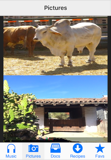
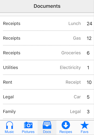
icons: ["music", "pictures", "docs", "recipes", "top_rated"],
labels: ["Music", "Pictures", "Docs", "Recipes", "Favs"],
selected: 1,
screens: ['music', 'pictures', 'documents', 'recipes', 'favorites']
}
// Init Tab Bar:
//==============
const myTabbar = new UITabbar(opts)
In the above options, the icons for the tabs are indicated as a class. You would use this class with CSS to show a background image as its icon. Each tab has an icon element that is used for showing the icon background image. On iOS the label will appear under the icon. On Android the icon element will be hidden, leaving only the labels. The selected value tells ChocolateChip-UI which tab should be selected at load time. Selection is zero-based, so the first tab is 0, the second tab is 1, etc. screens are the ids of the ui-screens you want the tabs to show. The tabs will be created in the order of the icons, labels and screens, so check your options to make sure you have everything in the right order.
Tab Bar Icons for Android
If you want your tab bar on Android to exhibit icons, you can override the default behavior by providing a optional property showIcons: true. ChocolateChip-UI will adust the height of the tab bar to accomodate the icons you provided, just as it does for iOS. Labels will be under their icons. You will need to provide additional styling to show the icons, same as is done for iOS.
Tab Bar with Navigation List
If you want a tab bar but have more screens than can fit, you can make the last tab a navigation list that directs the user to the additional screens. To set up the tab bar with a navigation list, just give the last tab the name "more". Notice how we've set that up:
const opts = {
   icons: ["music", "pictures", "docs", "recipes", "more"],
   labels: ["Music", "Pictures", "Docs", "Recipes", "More"],
   selected: 1,
   screens: ['music', 'pictures', 'documents', 'recipes', 'fruits']
}
In this case, the navigation list will be the final tab. It will have an id of "fruits". Tapping a navigation list item will take the user to a detail screen for that fruit. Read Navigation to learn how to set up navigation lists.
You could also use routing with the tab bar's navigation list. That is also covered by the section on Navigation.
You can look at the following files in the source code examples folder to see how these are put together:
- tabbar.html
- tabbar-nav.html
- tabbar-nav-routes.html
Read the following instructions for getting the examples.
Example of Tabbar
See the Pen Tabbar V5 by Robert Biggs (@rbiggs) on CodePen.
Tabbar with Android Theme
See the Pen Tabbar for Android V5 by Robert Biggs (@rbiggs) on CodePen.